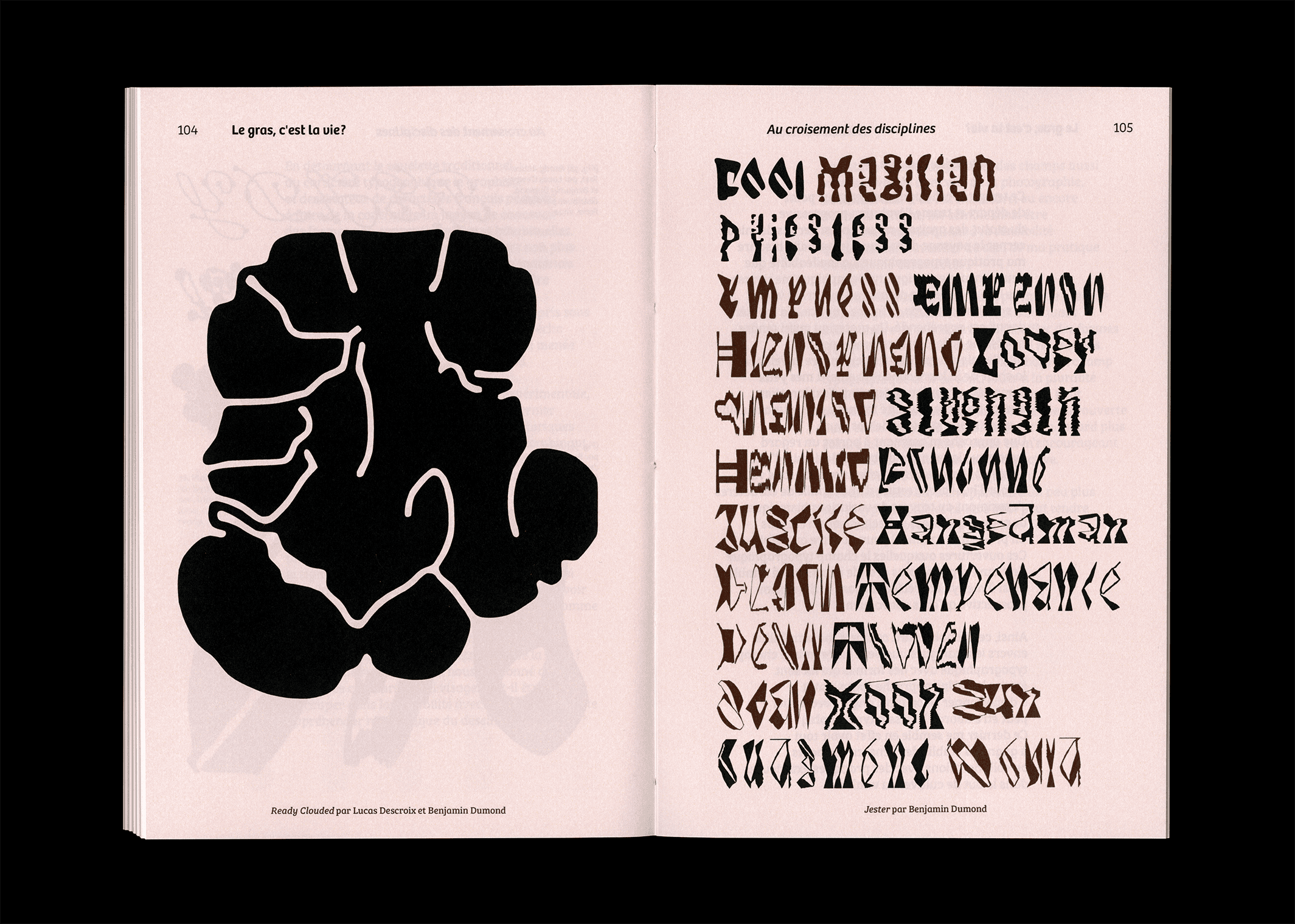
Le gras, c'est la vie ?
Publishing / 2024
Masterʼs thesis on the statue and the place of typographic weights throughout the past and contemporary type design's field. Taking as a starting point and following line the evolution of bold typefaces throughout the time, this book takes an interest on the many faces that can adopt the typographic signʼs malleability. Going to the first fat faces to the many stylistic variations that can welcome a typeface family nowadays, this thesis seeks to question the shapes this one can wear in the current typographicʼs landscape.